In Part 1 of Historical and Contemporary Visualisation Methods we looked at historical examples where data visualisation has been influential in this field. We left with the question – “Why visualise?”
This post will show an example and discuss why visualisation design is more than designing something pretty but is used to provide the reader with insight and understanding.
Alberto Cairo, in his book functional art, discuses visualisation design and looks at an article he read on the worlds population. The article discussed a conflicting view about the poor/rich fertility rate. The author suggests that the fertility rates of the poor and rich will merge and the population will stabilise. Whilst, many views claim that the poor fertility rates and the rich will decrease, blaming the poor countries for overpopulation.
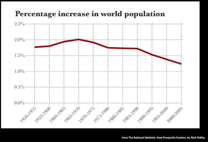
Ridley, M. (2010). Percentage increase in world population. The rational optimist: how prosperity evolves [Image]. Retrieved 22 August, 2018 from http://www.qsm.com/blog/2013/whats-story-your-data-0
The articles uses one graph (above) to support the claims. Whilst the graph is clear and simple, it is insufficient to support the claims made by the author.
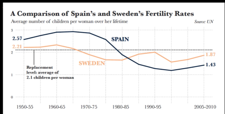
Cairo, A. (2013). A comparison of Spain’s and Sweden’s fertility rates [Image]. Retrieved August 22, 2018, from https://vimeo.com/176255825
Cairo gathered his own data on total fertility rates from the United Nations and created his own graphs to show that their is more sufficient way to support the argument made by the author. Cairo created a comparative graph about Spain and Sweden’s fertility rates (above). This graph provides clear, comparative data and gives the numbers a shape that helps the reader understand the data easier. However, to fully understand where the original article got its information we need to see the global fertility rates.
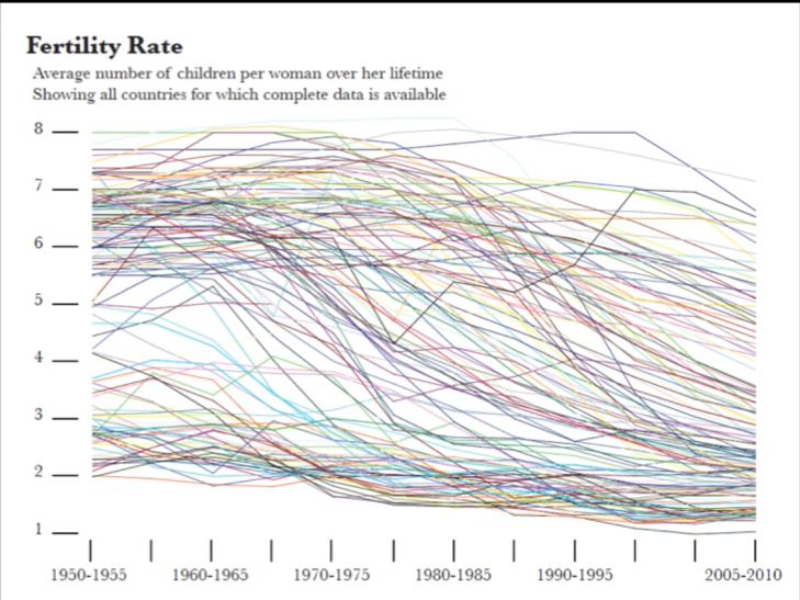
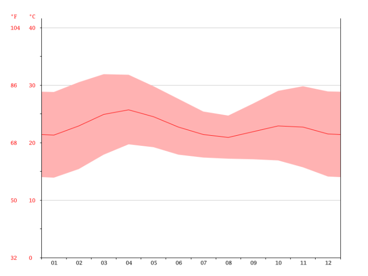
Cairo, A. (2013). Fertility rate [Image]. Retrieved August 22, 2018, from https://vimeo.com/176255825
This graph on Fertility rates is an excellent example of someone who has taken something that worked for a small set of data and let the software producing the graph create something on a large scale. Rather than interpreting the data and creating a graph that gives insight and understanding, this is the “default setting.” This graph is hard to look at and there is no visual hierarchy.
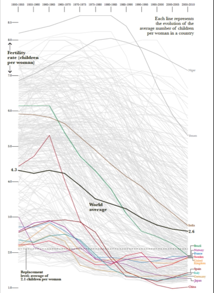
Cairo, A. (2013). Fertility rate [Image]. Retrieved August 22, 2018, from https://vimeo.com/176255825
Cairo created the above graph to display global fertility rates over time. This graph highlights a few poor and a few rich countries to help support the authors view and the hypothesis presented.
From this example provided by Cairo, we can see the importance of providing enough data for a reader to follow and argument or to engage in an evaluation for themselves. Visualisations need to carry meaning and provide the reader with enough information for them to see how a conclusion has been made. The examples of the historical visualisations shown in the previous post were simple in the data provided. The final visualisation in this post of a modern example is quite data heavy, requiring more of the reader. This suggests that we have more graphically/ visually sophisticated viewers than in earlier times.
Most important aspect and why?
This lecture discussed a really important point when designing data visualisations. That being, that the main function of data visualisation is to create insight and understanding for the reader not just present a pretty image. This helped my understanding in what I need to aim to achieve when creating data visualisations myself. Whilst appearance is important, it needs to carry function. For example the use of colour, font and layout to create visual hierarchy needs to be with purpose and to add meaning to the data, not just to create a beautiful image to look at. Our newsfeeds are full of pretty infographics that carry little to no meaning. I want to aspire to create data visualisations that carry meaning and educate the reader on something they couldn’t have seen without it.
Cairo’s example of how to properly support an argument with visualisations was very helpful in understanding how to approach this myself. Whilst the graph the reader used was clear and simple, it didn’t provide the reader with the chance to compare the data themselves. I found this important and helpful to see how Cairo pulled apart the information and displayed the data in a meaningful way. What worked for one set of data (the comparison between Spain and Sweden) didn’t work for the global comparison. It is important to understand your data and not just use a graph that the computer generate as, seen in the messy Fertility Rates graph, it is not always the best method of approach.
Reference
Cmielewski, L. (2016, July 25). Visualisation: Historical and contemporary visualisation methods- Part 2 [Video File]. Retrieved from https://vimeo.com/176255824