We live in a time where we all generate a lot of data. Everything we do seems to be connected to the online world and thus creates data trails. Every app you use, every site you engage with, every payment you make – it all generates data. Data is essential to helping us understand social, environmental and political systems. As the world changes and data increases, new visualisation strategies are needed to make sense of this data.
So what actually is data? Data is values of qualitative and quantitive variables belonging to a set of items and/or the result of measurements. (Waterson, 2016) Data by itself actually has no meaning. For data to contain information it must be interpreted to take on meaning. This is where data visualisation comes into things. What is data visualisation? Exactly as it sounds, data visualisation is the visualisation of data. It is one of the steps in data analysis and its goal is to communicate data clearly through graphs.
You have probably heard of the term infographic before. However, did you know there is a difference between infographic and data visualisation? Infographics are not necessarily based on data wheres all data visualisations are all information visualisations. Infographics often look pretty but don’t really contain a lot of information wheres data visualisations add meaning to information. For example the image below of an infographic about a process is not a data visualisation. It is a list of process not based on data.
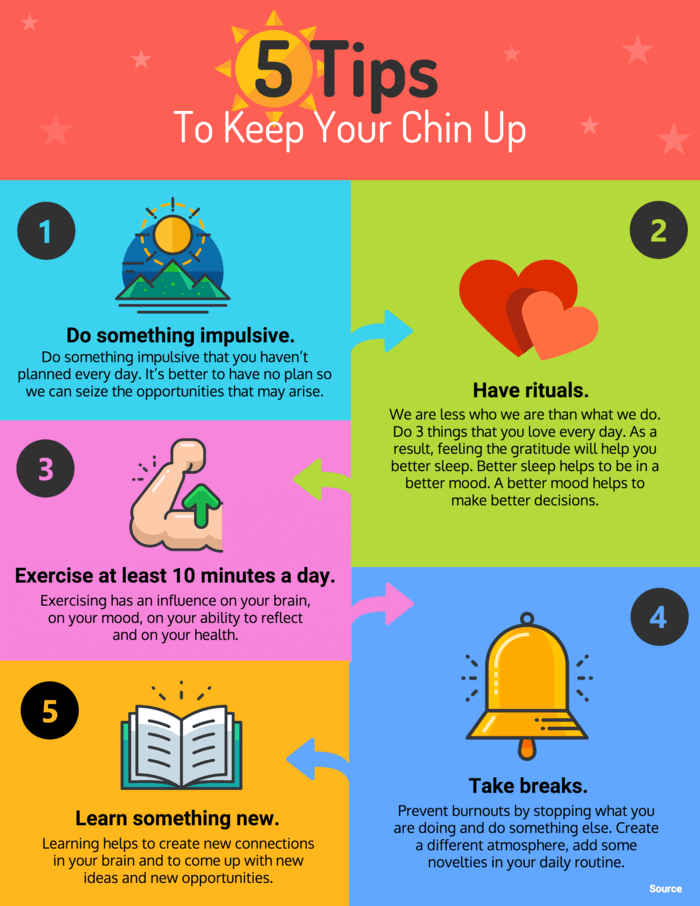
Mcguire, S. (2018). Happiness tips infographic [Image]. Retrieved 10th August 2018 from https://venngage.com/blog/9-types-of-infographic-template/
Effective visualisation makes complex data more accessible, understandable and usable. It helps users analyse and give meaning to information.
As Data Visualisation Designers processing, analysing and communicating data creates many challenges. It is important to use the right visualisation type for the different types of data we need to visualise. The bar graph is the most basic and common visualisation, however it is the best when comparing two variables (see example below). When trying to decide what type of visualisation to use you should ask yourself “Why should I not do a bar graph?”
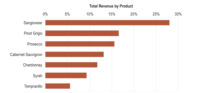
Unknown. (2015). Total revenue by product [Image]. Retrieved 10th August 2018 from https://irina150.wordpress.com/2015/10/08/bar-charts-versus-pie-charts/
The line chart or timeline (see example below) are the best default choice for looking at data over time. People are familiar and comfortable with both these types of visualisations and can read them easily. This is important as it allows for effective communication which is the foundation for our visualisation. The main role of the Data Visualisation Designer is to use data to tell a story.

Excel Easy. (n.d.). Line Chart [Image]. Retrieved 10th August 2018 from https://www.excel-easy.com/examples/line-chart.html
The 4×4 Model for Winning Knowledge Content
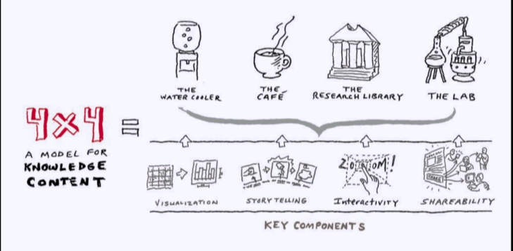
Shander, B. (2014). The 4×4 model for winning knowledge content [Image]. Retrieved 2 August, 2018 from https://vimeo.com/100429442
Most important aspect and why?
The most important aspect I took away from this lecture was that we as designers are to use data to tell a story. It is not about producing a “pretty picture” but whilst it is important to make visually pleasing, data visualisation is about interpreting data to give meaning and understanding. My understanding of data visualisation has already increased as I didn’t know that their was a different between infographics and data visualisations. My perspective has already changed on how I am to approach this semester and look to interpret data to tell a story. The reason this is important is because as communication designers if we are designing pieces that are not communication anything we have essentially failed at our job. Therefore, it is important to analyse data, interpret it and communicate it clearly so that the audience understands something that they wouldn’t have previously.
Reference
Waterson, S. (2016, July 18). What is data vis? [Video File]. Retrieved from https://vimeo.com/175177926
