Why do we use graphs?

As data visualisation designers we use graphs to make comparisons easier. Therefore, selecting the correct graph is important. Today it is quite common for graphic designers to select the wrong type of graph for their data due to trend, aesthetics etc. Currently bubble charts are quite on trend, however using circles causes us to always underestimate the size difference. Something to consider when selecting a graph type is that our eyes are good at calculating one dimension, however we are not good at calculation surface area (height X weight). Squares are much easier to compare more accurately.

In Albert Cairo’s book, The Functional Art, provides a ranking of graphic approaches to data based on human perception.

Screen Shot 2018-08-29 at 5.29.06 pm.png

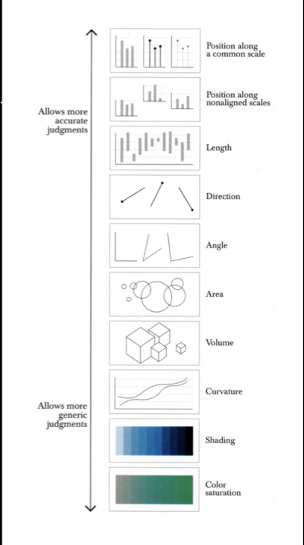
Cairo, A. (2013). Why do we use graphs? [Image]. Retrieved 3 September, 2018, from https://vimeo.com/177306425

Something like shading on a map to show height is used as a general indicator. It doesn’t need to be exact it is simply for relative comparisons. However, comparing dollar values using a bar graph is more accurate as it allows instant comparison.

The 3 most common graph types are:

  1. Time series chart
  2. Bar chart
  3. Scatter plot

Some examples of when to use certain charts:

Bar Chart: These graphs are familiar. They are one dimensional and easy to use to compare two things. They are best to use when comparing data across two categories.

Line Chart: This type of graph is used to display trends over time. For example the stock price over a 5 year period.

Pie Chart: This type of graph is used to compare relative proportions or percentages of information. For example the percentage of a budget that has been spent. A handy tip is if your data requires more than 6 pieces of pie, a different graph type would be more appropriate.

Most important aspect and why?

The most important aspect of this lecture was gaining an awareness of the importance of selecting the correct graph type to present your data. I have noticed the trend with bubble charts and have found them quite visually appealing, however hard to interpret. Therefore, it was interesting to hear that these are perhaps not the best graph type to use to present data to allow for accurate comparisons. The reason this was the most important aspect was because data visualisation is a new area of design for me, therefore I tend to think graphically rather than presenting the data in the best way to be understood. It is good to know that simple and familiar graph types, like the bar graph, are often the best form to present your data and that understanding the data is the most important aspect to remember. It was also interesting to learn that the human brain can only compare one dimension and calculating surface area is quite difficult. This is something I will need to keep in mind, again that understanding the data is priority over visual appearance.

Reference

Cmielewski, L. (2016). Data presentation styles: Why use graphs [Video File]. Retrieved from https://vimeo.com/177306425

Historical & Contemporary Visualisation Methods: Part 2

In Part 1 of Historical and Contemporary Visualisation Methods we looked at historical examples where data visualisation has been influential in this field. We left with the question – “Why visualise?”

This post will show an example and discuss why visualisation design is more than designing something pretty but is used to provide the reader with insight and understanding.

Alberto Cairo, in his book functional art, discuses visualisation design and looks at an article he read on the worlds population. The article discussed a conflicting view about the poor/rich fertility rate. The author suggests that the fertility rates of the poor and rich will merge and the population will stabilise. Whilst, many views claim that the poor fertility rates and the rich will decrease, blaming the poor countries for overpopulation.

Screen Shot 2018-08-22 at 11.13.11 am.png

Ridley, M. (2010). Percentage increase in world population. The rational optimist: how prosperity evolves [Image]. Retrieved 22 August, 2018 from http://www.qsm.com/blog/2013/whats-story-your-data-0

The articles uses one graph (above) to support the claims. Whilst the graph is clear and simple, it is insufficient to support the claims made by the author.

Screen Shot 2018-08-22 at 11.15.23 am

Cairo, A. (2013). A comparison of Spain’s and Sweden’s fertility rates [Image]. Retrieved August 22, 2018, from https://vimeo.com/176255825

Cairo gathered his own data on total fertility rates from the United Nations and created his own graphs to show that their is more sufficient way to support the argument made by the author. Cairo created a comparative graph about Spain and Sweden’s fertility rates (above). This graph provides clear, comparative data and gives the numbers a shape that helps the reader understand the data easier. However, to fully understand where the original article got its information we need to see the global fertility rates.

Screen Shot 2018-08-22 at 11.16.35 am

Cairo, A. (2013). Fertility rate [Image]. Retrieved August 22, 2018, from https://vimeo.com/176255825

This graph on Fertility rates is an excellent example of someone who has taken something that worked for a small set of data and let the software producing the graph create something on a large scale. Rather than interpreting the data and creating a graph that gives insight and understanding, this is the “default setting.” This graph is hard to look at and there is no visual hierarchy.

Screen Shot 2018-08-22 at 11.17.37 am.png

Cairo, A. (2013). Fertility rate [Image]. Retrieved August 22, 2018, from https://vimeo.com/176255825

Cairo created the above graph to display global fertility rates over time. This graph highlights a few poor and a few rich countries to help support the authors view and the hypothesis presented.

From this example provided by Cairo, we can see the importance of providing enough data for a reader to follow and argument or to engage in an evaluation for themselves. Visualisations need to carry meaning and provide the reader with enough information for them to see how a conclusion has been made. The examples of the historical visualisations shown in the previous post were simple in the data provided. The final visualisation in this post of a modern example is quite data heavy, requiring more of the reader. This suggests that we have more graphically/ visually sophisticated viewers than in earlier times.


Most important aspect and why?

This lecture discussed a really important point when designing data visualisations. That being, that the main function of data visualisation is to create insight and understanding for the reader not just present a pretty image. This helped my understanding in what I need to aim to achieve when creating data visualisations myself. Whilst appearance is important, it needs to carry function. For example the use of colour, font and layout to create visual hierarchy needs to be with purpose and to add meaning to the data, not just to create a beautiful image to look at. Our newsfeeds are full of pretty infographics that carry little to no meaning. I want to aspire to create data visualisations that carry meaning and educate the reader on something they couldn’t have seen without it.

Cairo’s example of how to properly support an argument with visualisations was very helpful in understanding how to approach this myself. Whilst the graph the reader used was clear and simple, it didn’t provide the reader with the chance to compare the data themselves. I found this important and helpful to see how Cairo pulled apart the information and displayed the data in a meaningful way. What worked for one set of data (the comparison between Spain and Sweden) didn’t work for the global comparison. It is important to understand your data and not just use a graph that the computer generate as, seen in the messy Fertility Rates graph, it is not always the best method of approach.

Reference 

Cmielewski, L. (2016, July 25). Visualisation: Historical and contemporary visualisation methods- Part 2 [Video File]. Retrieved from https://vimeo.com/176255824

What is Data?

We live in a time where we all generate a lot of data. Everything we do seems to be connected to the online world and thus creates data trails. Every app you use, every site you engage with, every payment you make – it all generates data. Data is essential to helping us understand social, environmental and political systems. As the world changes and data increases, new visualisation strategies are needed to make sense of this data.

So what actually is data? Data is values of qualitative and quantitive variables belonging to a set of items and/or the result of measurements. (Waterson, 2016) Data by itself actually has no meaning. For data to contain information it must be interpreted to take on meaning. This is where data visualisation comes into things. What is data visualisation? Exactly as it sounds, data visualisation is the visualisation of data. It is one of the steps in data analysis and its goal is to communicate data clearly through graphs.

You have probably heard of the term infographic before. However, did you know there is a difference between infographic and data visualisation? Infographics are not necessarily based on data wheres all data visualisations are all information visualisations. Infographics often look pretty but don’t really contain a lot of information wheres data visualisations add meaning to information. For example the image below of an infographic about a process is not a data visualisation. It is a list of process not based on data.

infographic

Mcguire, S. (2018). Happiness tips infographic [Image]. Retrieved 10th August 2018 from https://venngage.com/blog/9-types-of-infographic-template/

Effective visualisation makes complex data more accessible, understandable and usable. It helps users analyse and give meaning to information.

As Data Visualisation Designers processing, analysing and communicating data creates many challenges. It is important to use the right visualisation type for the different types of data we need to visualise. The bar graph is the most basic and common visualisation, however it is the best when comparing two variables (see example below). When trying to decide what type of visualisation to use you should ask yourself “Why should I not do a bar graph?”

bar graph

Unknown. (2015). Total revenue by product [Image]. Retrieved 10th August 2018 from https://irina150.wordpress.com/2015/10/08/bar-charts-versus-pie-charts/

The line chart or timeline (see example below) are the best default choice for looking at data over time. People are familiar and comfortable with both these types of visualisations and can read them easily. This is important as it allows for effective communication which is the foundation for our visualisation. The main role of the Data Visualisation Designer is to use data to tell a story.

line-chart.png

Excel Easy. (n.d.). Line Chart [Image]. Retrieved 10th August 2018 from https://www.excel-easy.com/examples/line-chart.html


The 4×4 Model for Winning Knowledge Content 

Screen Shot 2018-10-10 at 5.25.06 pm.png

Shander, B. (2014). The 4×4 model for winning knowledge content [Image]. Retrieved 2 August, 2018 from https://vimeo.com/100429442


Most important aspect and why? 

The most important aspect I took away from this lecture was that we as designers are to use data to tell a story. It is not about producing a “pretty picture” but whilst it is important to make visually pleasing, data visualisation is about interpreting data to give meaning and understanding. My understanding of data visualisation has already increased as I didn’t know that their was a different between infographics and data visualisations. My perspective has already changed on how I am to approach this semester and look to interpret data to tell a story. The reason this is important is because as communication designers if we are designing pieces that are not communication anything we have essentially failed at our job. Therefore, it is important to analyse data, interpret it and communicate it clearly so that the audience understands something that they wouldn’t have previously.


Reference

Waterson, S. (2016, July 18). What is data vis? [Video File]. Retrieved from https://vimeo.com/175177926