Ted Talk: Art From Data with Natalie Miebach

Natalia Miebach is a Boston-based artist who translates weather data in sculptures and musical notes. In this Ted Talk, Natalie goes through her sculpture creation of Hurricane Noel in 2007. She explains how she turned the weather data into a unique sculpture that can also be read and played as musical piece. Natalie explains that weather systems and patterns are invisible to most of us. However, by using sculptures and music, Natalie makes what was invisible, visible.

Natalie’s method of data visualisations means that these pieces are accessible through multiple outlets – art, science and music. The viewer is challenged visually depending on the environment it is viewed in.

Image result for nathalie miebach ted talk

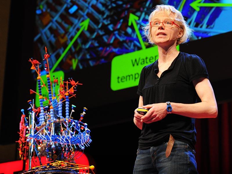
Miebach, N. (2011). Art made of storms [Image]. Retrieved 24 September, 2018 from https://www.ted.com/talks/nathalie_miebach

Most important aspect and why?

This was a really interesting and insightful was to view data and revealed that data can really be visualised in any way provided it create meaning. This approach is somewhat of a design technique in which Natalie applies using the data where the artwork output is purely reliant on the data. The most important aspect of this lecture was understanding that the data needs to inform the artwork or visualisation, not the other way around. Natalie ensures that the sculptures and the music created is a direct interpretation of the data. It isn’t manipulated to look or sound a certain way based on her personal interests. This was important because it reminded me that when approaching data visualisation it is important that the data informs the story told – that there is a story within the data not data within a story. In order to truly display original and unique patterns within data, this approach must be taken.

Reference 

Miebach, N. (2011, July). Art made of storms [Video File]. Retrieved from https://www.ted.com/talks/nathalie_miebach

Ted Talk with David McCandless

The Beauty of Data Visualisation

In this Ted Talk, David McCandless delivers an intriguing presentation about the beauty of data visualisation. Figures and numbers are often hard to understand without the appropriate context. Visualising data allows you to see the hidden patterns that you wouldn’t have seen otherwise.

A saying going around at the moment is “Data is the new oil,” implying that the world is run off data. However, David reworked this saying to “Data is the new soil,” and described data as a fertile creative medium.

We are taking in visual data daily, however a lot of what we see is subconscious. Therefore, as data visualisers we can use this to alter perspectives and views. Absolute figures, often shown in the media, don’t really tell a full story. To make comparisons, and tell a story through data we need relative figures.

Visualising data allows for knowledge compression. We are able to allow of lot of information to be consumed quite easily when visualised correctly. Data visualisation can go beyond figures and numbers to ideas and concepts. We can then use it as a tool to explore worldviews and understand other cultures. For example, visualising conflicting political views can be easier to comprehend and take on board than being told them.

David concludes by displaying that data visualisation is about information solutions which can bring clarity and answer questions quickly and easily.

Most important aspect and why?

The most important aspect of this Ted Talk was understanding the power of data visualisation and its capability to change mindsets. The reason for this is whilst it is excellent to compare different figures and understand the budgets of countries etc, data visualisation can also be used to understand different cultures and why people do the things they do. With the right approaches and patterns revealed, this could help create harmony between cultures. Understanding often helps change behaviours and removes assumptions. Creating data visualisations that help people understand each other and the motivations behind things could help to remove hostility and create a more peaceful world. This Ted Talk again showed me that design really can be a powerful, when used correctly, to bring positive change and alter mindsets within society.

Reference 

McCandless, D. (2010). The beauty of data visualization [Video File]. Retrieved from https://www.ted.com/talks/david_mccandless_the_beauty_of_data_visualization